3 Facebook Post Styles to Test Engagement
Facebook allows for many different types of posts that you can use to engage your community. In this post I’ll show you 3 styles of Facebook posts that you can use. You’ll also see different teaser copy or text in the post to get users to click on the link. Use teaser copy to play at your readers’ curiosity. The article I am using in this example was a news story about how the girlfriend of the Alabama quarterback went viral because ESPN announcers went gaga for her on air.
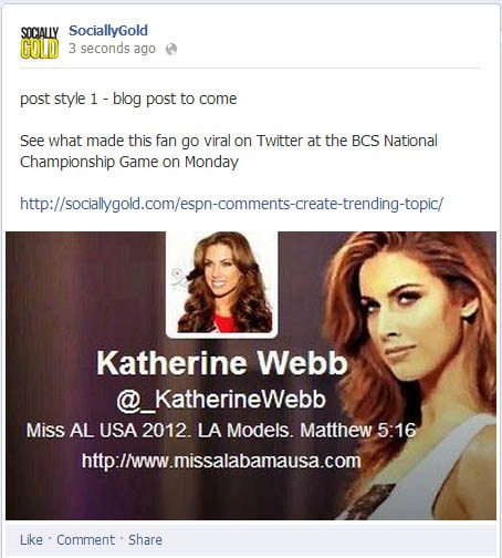
1. Image+Link
This post style allows the image to be large and you can include the link to whatever article or post you want your readers to go to. This is my favorite to use because it uses a larger image and is more attention grabbing. I do use it with caution as the link can be missed if the image is too engaging. You’ll see a big difference in image sizes of the three different styles

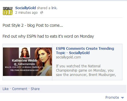
1. Post style 2 – Thumbnail
When you ad a link to a post, Facebook will auto-generate a link and a thumbnail for you. To not have it do that, like in the image above, click the x in the thumbnail before you post it, and the thumbnail will go away allowing you to upload your own image.
If your article has multiple images, you can also choose which image you would like as the thumbnail. You’ll also notice that I deleted the original link that I used from the post, and users can click the image and it will take them to the article. Below you’ll see a style with the link included. I always delete the link as it looks cleaner to me.

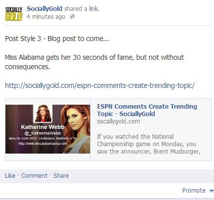
3. Post Style 3 – Thumbnail+Link
This style is my least favorite in that it isn’t as pretty to look at. The link is long, ugly and you are providing the link twice. Facebook gives you the option of keeping the link or deleting it. I like to play with each of these styles to see which get’s more engagement. If you aren’t measuring your Facebook engagement…you should be.
Do you have a preference of style that you post your articles on Facebook? Let us know in the comments.

