Facebook Introduces New Paper iOS App

It’s been 10 years since Facebook started in a Harvard dorm room. I can hardly believe it. Today, closing in on 1.25 billion users, Facebook released a new iOS app, Paper, which totally flips how you view your Facebook content.
I was a little surprised at how quiet this launch was compared to other Facebook announcements. The app is not just your Facebook redesigned, it’s a completely new app.
Here is my initial good and bad about Paper.

The Good
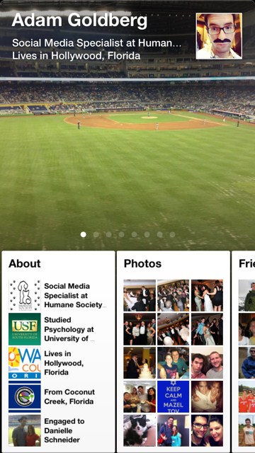
Paper is very visually appealing. Photos take up the entire screen and the transitions when between content is nice too. You’ll notice the omission of a refresh button, but updates fly in rapidly as they’re posted. A little box with a number will appear that alerts you to new updates and the cards at the bottom can be flicked up for a full screen view.
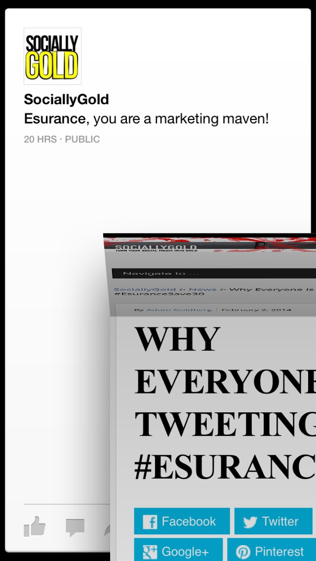
When you come across an article you’d like to read, tap it once to make it full screen, then tap it again to initiate a flip-up animation that takes you to the full article. When you’re done, swipe down and you’ll get a similar flip animation to close it.
The app doesn’t have any advertising yet, but don’t worry, I’m sure it will.

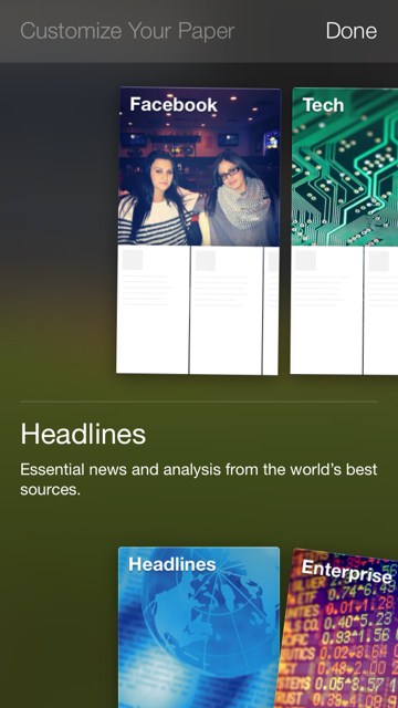
I like how you can customize your Paper. You can choose from already determined categories that the app provides. Facebook has also chosen a handful of publishers that users will be exposed to. Some of the news outlets that are included, I would never search on my own. Topics that you can choose from include; Headlines, Tech, Enterprise, Creators, Flavor, Ideas, Family Matters and more.

Photo Viewing
Another feature of the app is that you can rotate your phone to view all parts of a full screen photo. This may not be the best way to convey it, but these images show the different aspects of a larger image.


The Bad
When a new update is posted, you’ll be prompted to click a button that will take you to the most recent post, scrolling at super speed past updates you have already seen. I found myself seeing the same updates over and over.
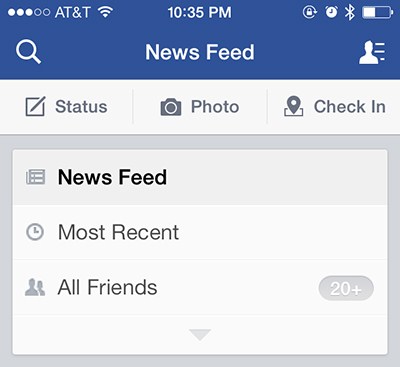
Unlike the main Facebook app, you can’t specify Most Recent vs News Feed. I’d like to see the most recent updates and toggle between that and posts that are getting traction among my friends. I am still seeing updates about how badly the Broncos played during the Super Bowl a day later.

Overall
I have to give Facebook a lot of credit for creating such a visually appealing app. The gestures and animations are really nice too. Hopefully more are added in future versions. Paper isn’t going to replace my main Facebook app yet, but I’ll definitely keep exploring. Right now, Paper is only available for iOS and you can download it directly from the Apple app store.
What do you think?
Have you had the chance to check out Paper? Leave your thoughts down below.
